Did Scotland see an increase in excess deaths in 2022?

“Don’t kill granny” was our aim in 2020. How did that work out for 2021 and 2022 when we look at excess deaths?

Well, it’s been a wee while. I’ve had a busy year, but it looks like the various excess deaths problems I looked at a year ago haven’t gone away. Why should we bother looking at excess deaths anyway? Are these excess deaths a problem?

There’s a lot that’s been written about excess deaths and what they mean. One critical article on their use by Norman Fenton and Martin Neill states:

…one of the standard approaches for determining whether increased death counts are likely explained by COVID and/or lockdowns is to use the previous 5-year datasets of death numbers and the model ‘fitting’ approach described above…you need to be very wary if you see conclusions about the current week, month or year death numbers being ‘significantly above the 5-year average’. 

https://wherearethenumbers.substack.com/p/what-can-we-learn-from-very-few-data

However, there have been various reports in the media and from the Office for National Statistics (ONS) on excess deaths and their increase over the last two years. Opinions differ about their use, but my main argument is: if the various interventions intended to prevent death from COVID-19 have been effective, shouldn’t the all cause excess deaths in 2021 and 2022 show a decrease compared to 2020? If we can see a reduction in all cause deaths in the last two years, this implies that the various COVID-19 interventions were effective and saved lives, and that the vaccination programme hasn’t caused further deaths.

Of course, it’s all a bit more complex than that due to various other economic and political factors. That aside, what do the raw data say about the excess death situation in Scotland?

First off, some background on the data. The reason I’m sharing these more detailed excess deaths data is because Public Health Scotland (PHS) on their dashboard only shares excess deaths for two age ranges: under 65 and 65 and above. This doesn’t show the full range of detail available in the deaths data, and may miss important changes in specific age groups.

I’ve published the code I used to calculate excess death and the data on my Github page.

What age categories are in the data?

I used two datasets supplied by National Records of Scotland to calculate excess deaths:

  1. “Weekly deaths by sex and age group, 2000 to 2019” which was used to calculate the baseline data using weekly mortality by age group from 2015 to 2019
  2. “Weekly deaths by sex and age group in NHS health boards, 2020 – 2022” which contains weekly deaths for 2020 to 2022 divided by cause.

The age categories are in (mostly) 5 year groups which can be seen in the weekly deaths graph for 2015-2019 shown below.

A graph showing Scottish weekly deaths (2015-2019) divided by age group.

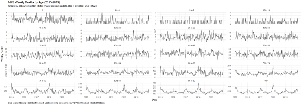
I’ve put each age group in a subplot. The range of weekly deaths is quite different for each age group – check the scales on the vertical axes before making detailed comparisons.

The 2000-2019 deaths data have different age categories to the more recent deaths data. I’ve combined the 90-94 and 95+ age ranges from the 2000-2019 deaths data into a single 90+ age range. This makes the age ranges of both datasets compatible.

Which years should be used?

The ONS changed the method used to calculate excess deaths in 2021 and 2022. Typically, deaths data from the previous five years (from 2015 to 2019) would be used to calculate a baseline for the next year. However, due to the larger number of deaths in 2020, their calculations for 2022 use deaths data from 2016 to 2019 and 2021 instead. Out of curiosity, I’ve calculated excess deaths for 2022 using both age ranges (just 2015-2019 and 2016-2019 plus 2020). Both datasets are on Github and the baseline results are shown below.

A graph comparing average Scottish deaths divided into age groups for two five-year periods: 2015-2019 and 2016-2019 plus 2021.

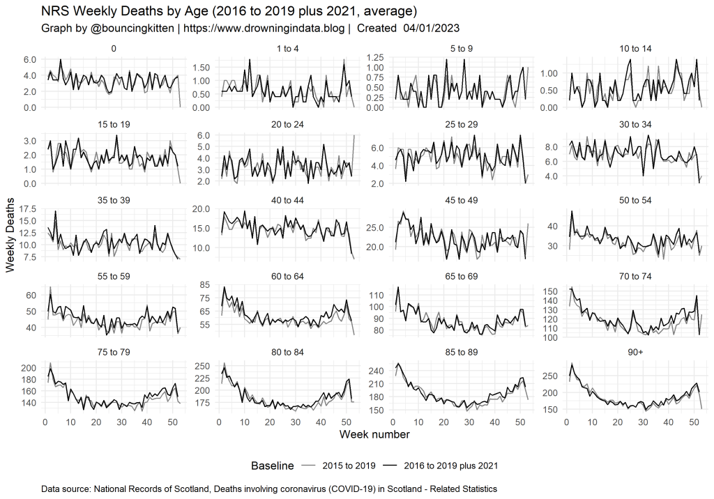
In most cases, the baseline deaths using 2015 to 2019 only are slightly lower than the baseline using 2016 to 2019 plus 2021. This slightly reduces excess deaths for 2022 based on the latter data.

Are the data complete?

John Dee’s Almanac has pointed out that deaths data for England from the ONS in 2022 aren’t yet complete. There’s a huge lack of death at the end of 2022 compared to other years. There could be several reasons for this (delays in processing data, backlogs of autopsy reports…). The Scottish data appears to be more complete, but the data should be re-checked at intervals to find updates.

Excess deaths data

Excess deaths for all the age groups in the NRS data are shown below. I’ve only shown the 2016-2019 plus 2021 excess deaths data here – the other datasets are available on Github.

A graph showing excess deaths in Scotland for 2020 to 2022 divided up by age groups.

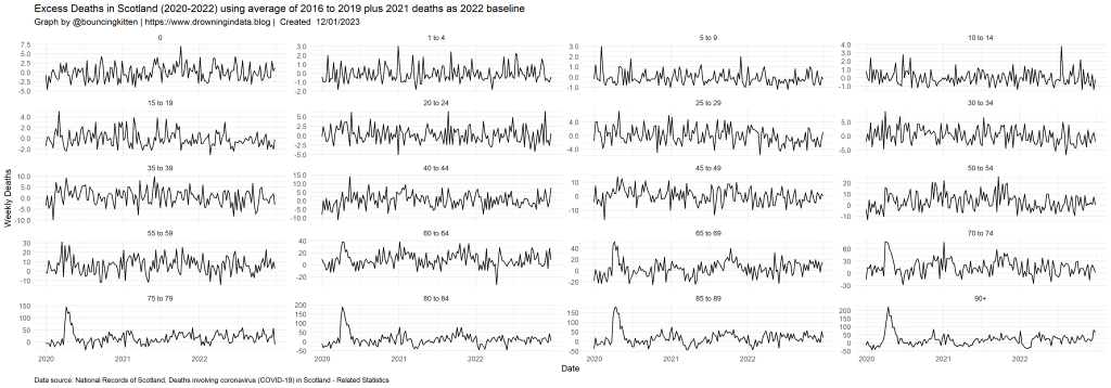
I find it hard to see what’s happening in these graphs. The high peaks in April 2020 for most age groups above 55 stick out. Apart from that, it’s hard just to glance at the graphs and see what’s going on. Calculating the cumulative excess deaths for each year can be more helpful.

A graph showing cumulative excess death in Scotland for 2020 to 2022 divided up by age group.

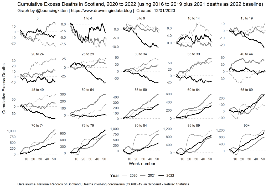
The cumulative graph helps to show what’s going on more clearly. Looking through each subplot, we can see which age groups had larger excess deaths in 2022 compared to previous years.

Coming back to my original question (Have excess deaths in 2021 and 2022 decreased compared to 2020?) we can look at each graph and check where the bold black line (for 2022) and grey line (for 2021) are higher in week 52 than in 2020 (thin line).

In general, in age groups younger than 50, 2021 and 2022 showed fewer excess deaths than 2020. In some age groups (especially the youngest) there are few deaths in most years, so (for example) a 50% change in cumulative excess deaths may not be very significant.

In other age groups, three show higher excess deaths in 2022 than in 2020. These are 55 to 59, 65 to 69 and 75 to 79. Several show higher excess deaths in 2021 than in 2020. These are 50 to 54, 55 to 59, 60 to 64, 65 to 69 and 70 to 74.

Did excess deaths increase?

For the majority of the age groups who were considered the most at risk in society, excess deaths in 2021 and 2022 were generally higher than excess deaths in 2020.

Our aim in 2020 was: “Don’t kill granny”. It looks like unexpectedly high numbers of grannies died in 2021 and 2022, despite all our attempts to reduce death and infection.

COVID underlying cause vs contributory factor: comparing John Dee’s England results and NRS Scottish results

English COVID underlying cause vs contributory factor graphed by John Dee shows high correlation. What do the Scottish data look like?


Update, 13/01/2022: I asked National Records of Scotland about the dates used. This dataset uses death by date of registration. The “Deaths involving coronavirus (COVID-19) in Scotland – Related Statistics” are based on date of registration unless stated otherwise in the dataset title.


John Dee’s almanac is an interesting substack page written by a former NHS data analyst. They’ve posted several interesting pieces of analysis on COVID data from a variety of UK sources.

One post that caught my attention was this one: Dying with Precision: Causal vs. Co-Morbid Death. This presents a straight line graph of COVID causal versus COVID co-morbid deaths for England and Wales from the Office for National Statistics data.

I have the Scottish data for that period (via the National Records of Scotland). How does that look?

Note the different terms to describe the deaths. In the NRS data they’re labelled “COVID-19 underlying cause deaths” and “COVID-19 contributory factor deaths”.

A graph of weekly Scottish COVID-19 underlying cause deaths versus COVID-19 contributory factor deaths (data runs from week 1 to week 50).

It looks like the Scottish data isn’t as neat as the English data that John Dee graphs. Note that it’s not clear from the NRS data whether these are deaths by date of occurrence or deaths by reporting date. I’ve asked for clarification on that point (some of the NRS datasets state it explicitly; the one I used here doesn’t). Perhaps that accounts for some part of the straight line behaviour John Dee observes.

The Scottish data still shows a pretty good correlation though – Pearson’s correlation is r = 0.766 (p < 0.001, n = 50, 95% CI [0.724,1.000]).

Interesting!

Linking excess deaths and SARS-CoV2 vaccinations in Scotland

Has there been any effect of the rollout of SaRS-CoV2 vaccinations on excess deaths in Scotland?

Has there been any effect of the rollout of SARS-CoV2 vaccinations on excess deaths in Scotland?

One simple way of showing a relationship between two datasets is to graph one against the other. This is made more complex with a changing situation like monitoring the rollout of a vaccine. The vaccine programme has ensured that around 95% of Scotland’s most elderly population has now had their first dose of either the Pfizer or AstraZeneca vaccines. I’ve linked these together in this way:

  • Calculate the number of excess deaths per week recorded in 2020 and 2021 for each age group
  • Read the cumulative percentage of the population that has been vaccinated in each age group since vaccinations began in December 2020
  • Graph excess deaths versus versus cumulative percentage vaccinated
  • Label each weekly datapoint with the date.

This way I create a graph that shows the relationship between time, excess deaths and the percentage of each age group vaccinated.

Our hope is that over time the number of excess deaths (which is expected to be caused mainly by COVID-19) should reduce as the percentage of the population vaccinated increases.

So I start with calculating excess deaths. This uses the average deaths over the previous 5 years (2015-2019) and is defined as Excess Deaths = Deaths in 2020 and 2021 minus Average Deaths for 2015-2019. I’ve calculated excess deaths for each week and for every age group available. The 2015-2019 and 2020-2021 deaths are available from the National Records of Scotland. I calculated the whole country deaths by summing the deaths for every health board for each of the age groups.

Here are death data for 2015-2019.

Weekly deaths in Scotland by age, 2015-2019.

When averaged, they look like this:

Average weekly deaths in Scotland, 2015-2019.

Deaths for 2020-2021 look like this:

Weekly deaths (all causes) by age, 2020-2021

Then, excess deaths for 2020-2021 look like this:

Excess deaths since vaccination began by age group.

The cumulative vaccination data are graphed next. This data is available from NHS OpenData.

Cumulative percentage of age group vaccinated by date.

One thing to note is that the age groups for vaccinations and excess deaths are different. Thankfully, they generally overlap nicely except for 16-29 (vaccinations) and 15 to 19, 20 to 24 and 25 to 29 (excess deaths). However, this has little effect on the general picture as very few 15 year olds die each week.

Finally, now that I have excess deaths and cumulative percentage of each age group vaccinated, I can then graph them together. I’ve concentrated on Dose 1 of each vaccine as the majority of those vaccinated have only received that dose.

Excess deaths versus cumulative percentage of age group vaccinated.

My observations are:

  • Vaccination is associated with an increase in excess deaths from mid/end January until end February for the oldest three age groups (45, 151 and 113 weekly excess deaths for 18/01, 25/01 and 01/02 respectively for the 80+ age group – which increased from -19 excess deaths on 11/01)
  • There are more moderate but maintained excess deaths in 55-59, 60-64 and 65-69 between 25/01 and 15/02 (but it’s hard to say anything for 55-59 and 60-64 because less than 50% of those age groups has been vaccinated so far)
  • There are no observable effects in the youngest age groups (but these have less than 12% vaccinated)

This analysis doesn’t prove a causal link between vaccination and excess death. After all, I don’t have access to data which shows the number of those who died each week who had been vaccinated. There are several other factors that may also have led to excess deaths over that period – the ongoing lockdown and COVID being the two most obvious factors. However, the rate of COVID deaths has also decreased over that period, and no one yet knows the full effects of lockdown on excess deaths.

The main point is that in the age groups that have received the majority of vaccinations, the weekly number of excess deaths has been maintained (and increased in some age groups) throughout the first dose vaccination programme, and is only reducing now that it has largely ended.

If there is a causal link between vaccines and excess deaths, is the number of deaths associated with the vaccination programme an acceptable cost for reducing the risk of SaRS-CoV2 transmission for the rest of the population?